A countdown with the best logos that represent a country to the world.
 Each country has its own brand, It is represented by a logo, who is used mainly for promoting world tourism and as a merchandising piece towards the countries in each one of its applications; magazines, TV spots, posters, objects, and an endless advertising campaigns to promote a destiny, a culture, a place.
This is what is known as the country brand:
“(…)It is to have an identity, a name and a reputation At the current global cross-roads it is important for countries to differentiate themselves from others and thus compete in the international arena.
The country brand brings together unique aspects of a country. These can be natural, like Canada’s Niagara Falls or the United States’ Grand Canyon or man-made, like the pyramids of Egypt.
Products that have achieved acclaim can also come to represent a nation such as Russia’s vodka, Peru’s pisco, Italian pizza, Scotch whiskey, American hamburgers and Colombian coffee.(…)” (a)
For this countdown I had on my mind not only how “pretty” the logo could be but itsreproducibility and functionality from a graphic design point of view, a logo which to the designers It’s versatile besides impressive, that allows us to apply everywhere and any object, being recordable. For this purpose many times it needs not go further but being subtle. Many of the logos represented by each country are assertive, but in other cases there is a lack of strength and capacity which it would subtracts enhance to its country as a touristic destination.
A head the list having in mind: 1. Its esthetic 2. Functionality 3. Symbolism: (Let Us remember that this can be object of discussion and subjectivity, but as a designer this is my personal point of view)..
The top ten logos:

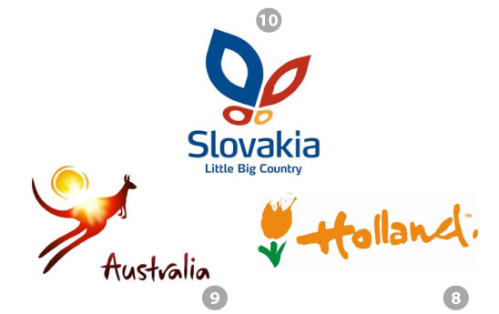
10.Eslovaquia: Modern, simple, a good slogan, totally reproducible, compact.
9.Australia: One of the Net’s favorite, It does use of its main symbol to the world, looking effortless, the kangaroo. It is interesting the way is created a photographic simulation moment to the human eye and how it speaks about a “wild adventure”, even though It could have reproductively problems on surfaces due to the use of gradients and not being compact, forcing to use another more simplified versions of the logo to its reproduction.
8.Holanda: The tulip, a pretty common image of the Holland country, with out going further it explodes its shape with a simple way but assertive, It is recordable as well.

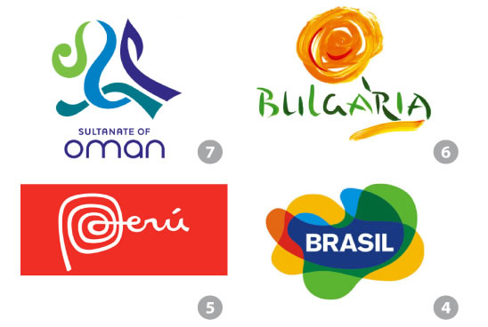
7.Oman: Mysterious, elegant, subtle, proportionated, harmonic.
6. Bulgaria: I must confess It is one of my favorites, It’s so artistic, its rose symbolism and that texture created along with the colors is a great combination, not often It’s a logo that might be a little complicated to reproduce, taking away versatility (let Us imagine an electronic embroidery on a garment, probably We would have to synthesize the shapes of the logo making a variation from the original).
5. Perú: The Peruvian case is interesting, there was a total redesign of its logo which the old one, more than a logo, It was a romantic illustration that was not up to the requirements of simplicity that a brand must require, here follow the link to see it. With an assertive extreme makeover it was renewed by this beautiful, intrinsic and simple image; art, symbolism and culture are exposed with this new propose.
4. Brasil: Joy, Samba, party, It’s a versatile logo, dynamic, I am sure We have the symbol on our minds because we saw it on a previous occasion.

3. Bahamas: A modern logo, versatile, an interesting visual game that creates according to the geographical position of the islands, showing us variety, paradise, touristic destination.
2. Indonesia: Majestic, with a lot of strength, looking at this makes me want to travel and know this country, its fauna, its culture, a simple beauty.
1. México: My favorite, It does not need any symbol, just by its beautiful typography game It recalls about its culture, its ancestors, its places, its art, a versatile logo by beautiful colors, almost like a jewelry piece, reproducible in any surface, full of simplicity and strength, pride for the Aztec country. It gathers all the qualities from a good logo, for sure We had seen it before, It is memorable, the shapes and the textures of each one of its letters show a country of contrasts, variety of activities, climates, stories Etc. A great logo symbol
To see the other logo symbols that does not appear on this list follow this link and judge your self (some of the world country logos does not appear on this list but iIt does the most of them).

Zoom of the beautiful Indonesia bird logo.
To conclude, these symbols travel kilometers, countries, nets, carrying with them a message who speaks about a nation, a destiny, looking to represent, in an assertive way or not, creating an empathy with the spectator, a remembrance, all these with the help of merchandising campaigns, which in a success case, attracting a stranger to live an unknown new adventure.
¿What do You think?, by judging, ¿Which one is the best logo? ¿Do You feel properly represented with your country logo?
Sources:
(a) ¿What is a country brand? Web-page: “Colombia is Passion”.
[polldaddy poll=8051532]